The classification used to divide our world to developed and developing countries is outdated and harmful, it’s time to update our mindset.
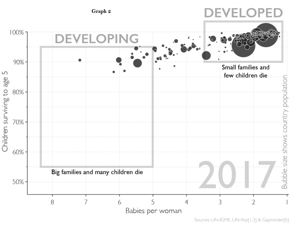
For generations, it has been customary to divide the world’s countries into developed and developing countries. The name “developing countries” is considered a more Politically Correct term than “third world countries”, as previously taught in schools. In general, diving the world into two groups is easy to understand and clear, it helps us to sort things in our minds. One way to divide countries into developed and developing countries is by average birth levels. The first graph, taken from the wonderful site Gapminder, shows the average number of births per woman, correlated to the percentage of child survivability to age 5. A quick glance at the graph provides immediate understanding of the classic division. The graph clearly shows two groups of countries – those with high birthrates and high toddler mortality, and countries with low birthrate and low toddler mortality – developed and developing countries. The thing is- the graph is from 1965!
When looking at more updated data, such as the graph from 2017, the picture seems to have dramatically changed. Birth rates in most countries have dropped significantly, and there has been a significant reduction in child mortality by age 5. The conclusion is clear – the division of developed and developing countries is no longer effective, and we need to find a more useful classification if we want to reflect a more correct view of the world.

In his book Factfulness, Health Professor and statistician Hans Rosling comes out against the classic perspective. According to him, the use of concepts such as developed and developing, rich and poor, “we” and “them” is problematic, mainly because it ignores the significant and varied achievements of those “developing” countries in recent decades, and provides a distorted view of reality.
Rosling and his writer collaborators offer a new and more useful division – a four-level breakdown, by daily income:
Level 1: Approximately a billion people are at this level in the world today, earning less than $ 2 a day *. They walk barefoot, cook on an open fire (such as bonfires), carry buckets of water and sleep on the ground. They have no ability to purchase food and have no access to medical services. People at this level would reside in countries such as Madagascar, Nepal and Lesotho.
Level 2: Most of the world’s population exists at this level, about 3 billion people, and they earn $2-8 a day *. People at this level may have basic property such as a bicycle, mattress or gas cooker for home cooking. Severe illness can cause them to spend all their property on medical care, bringing them back to level 1. People at this level would reside in countries such as Bangladesh, China, Zambia and Nigeria.
Level 3: Approximately a billion people are at this level in the world today, earning $8-32 a day *. People at this level have access to running water, they may have a scooter or other worldly possesions, and their meals are rich and varied. People at this level would reside in countries such as Egypt, the Philippines, Rwanda and the Palestinian Territories.
Level 4: Approximately a billion people are at this level in the world today, earning over $32 a day *. They have running water in their home taps providing both hot and cold water, they have vehicles, plenty of food, and probably had a real chance to finish 12 years of schooling. Most people living in North America, Germany, Israel, South Africa, Sweden or South Korea are at this level.

* The amount of income is adjusted tor the cost of living of each country
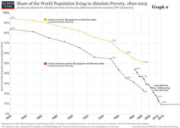
It is important to note that this new distribution to levels is not in relation to whole countries, rather it is relevant to the level of income per person. A nation will not belong to a single level as different levels of income may exist in one nation, but the prevalence of the different levels varies from country to country. This type of leveling method also provides the feeling that a transition from one level to another is possible, which is indeed the case. The third graph shows the prevalence of absolute poverty worldwide, and its significant decline over the years. It can be easily recognized in the graph that over 90 years ago, over 90% of the world’s population lived in absolute poverty, between 20% and 30% in 2000, and today the figures indicate less than 10% living in such poverty. People are moving up receiving more income and their quality of life is constantly improving. Therefore, our mind’s prception of “we” and “they” is just wrong!
The World Bank has also adopted this newer approach. In Rosling’s words: “It took the World Bank 17 years and 14 more of my lectures before officially announcing that it was abandoning the ‘developed’ and ‘developing’ divisions and would now use the four-level income distribution. The UN and most other global organizations have not yet done so.” The recognition by the World Bank is a very significant step, making it clear to investors and companies around the world that there are growing markets that are becoming more relevant, and should be considered by these investors as viable options.
Like me, you probably will not be comfortable using the terms “developed” and “developing” when Will Will you adopt Rosling’s new division?
Sources:
- https://books.google.co.il/books/about/Factfulness.html?id=j-4yDwAAQBAJ
- https://ourworldindata.org/extreme-poverty
- https://www.gapminder.org/topics/four-income-levels/
- https://www.gapminder.org/topics/fertility-child-mortality/
- https://datahelpdesk.worldbank.org/knowledgebase/articles/906519-world-bank-country-and-lending-groups